What is the Pantone Color System? A Comprehensive Guide for Designers

What is the Pantone Color System? A Comprehensive Guide for Designers
Welcome back to another deep explanation into the fascinating world of design. In this blog, we’re Looking into a crucial topic that affects designers across various industries—color representation. Whether you're a fashion designer, a graphic designer, or someone in manufacturing, accurately representing color across digital and physical media is essential. That’s where the Pantone Color System comes into play.
If you’ve ever wondered how you can take the perfect shade of digital red or blue and ensure it translates precisely to fabric or packaging, keep reading! In this blog, we’ll break down the Pantone Color System—what it is, how it works, and why it’s indispensable for achieving color consistency in your designs.
What is the Pantone Color System?
Pantone is a color matching system developed to help designers communicate and reproduce colors consistently across different industries. Founded in 1963, Pantone has become the global standard for color identification and reproduction.
The Pantone Color System includes thousands of unique color codes that represent specific shades, ensuring that colors are reproduced with precision, whether they’re printed on paper, fabric, or any other material. It’s especially important when transitioning from the digital world (like on your MacBook screen) to the physical world (like printed garments or products).

Why Do We Need Pantone?
In the world of design, color is everything. Think about it: You’ve got a perfect shade of olive green on your digital mockup, but once you translate it to fabric, the color might look off. Why does that happen? It’s because colors look different depending on the material, lighting, printing process, and even the device you're using to view them.
Pantone solves this problem by providing a standardized system that accounts for these variables, ensuring that your designs maintain color accuracy regardless of the medium or material.
How Does the Pantone Color System Work?
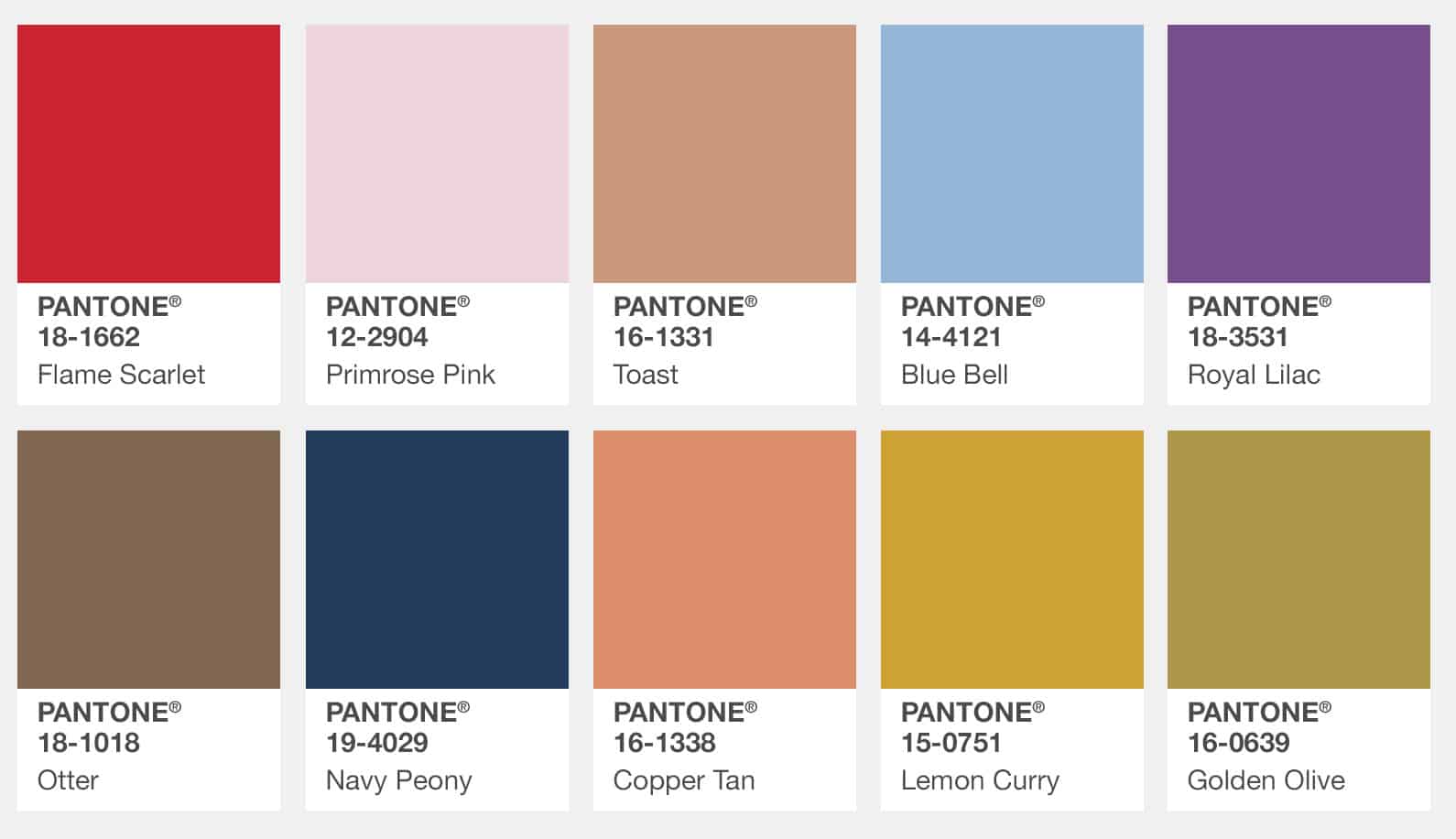
Pantone achieves color consistency by creating a set of Pantone Color Guides, each tailored to specific printing applications. The core idea is simple: Pantone assigns a unique number or code to every color, so there’s no ambiguity about how that color should look in any given application.
Here are some of the most popular Pantone guides you might use as a designer:
Pantone Solid Coated & Solid Uncoated
These are used for printing on different materials. Solid Coated is designed for glossy, shiny papers (think packaging, posters), while Solid Uncoated is for matte or uncoated materials (like standard letterhead or cardstock).
The same color in both guides will look slightly different because of the paper finish. The coated version will appear more vibrant and saturated due to its gloss, while the uncoated version will look more muted and desaturated.

Pantone TCX (Textiles)
This guide is specifically for fashion and textile designers. Pantone TCX provides color codes optimized for fabric, accounting for how colors appear on cotton, polyester, and other materials.

Pantone Polyester
This is a more recent addition, designed specifically for polyester-based fabrics. Polyester holds colors differently than cotton (it’s often more vibrant and saturated), so the Pantone Polyester guide helps ensure the color looks right when applied to this fabric.
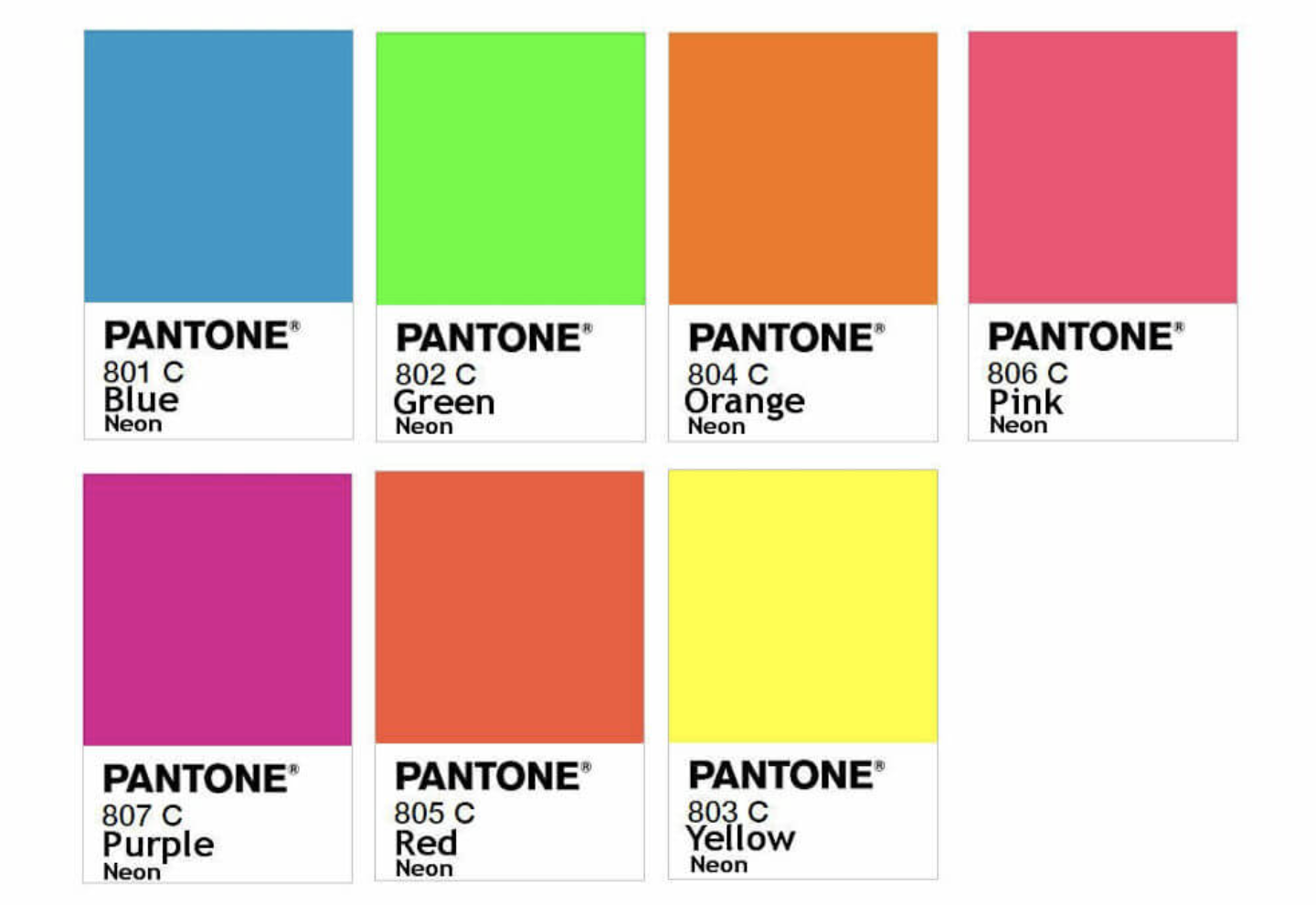
Pantone Neons
Neon colors are notoriously tricky to reproduce accurately. Pantone developed a Neon Color Guide specifically for bright, fluorescent colors used in fashion and design.

How Pantone Helps Designers in Fashion
Imagine you’re designing a new line of sportswear or streetwear, and you want to achieve that perfect shade of olive green for your joggers. You can see it clearly on your screen, but how do you make sure it appears the same in the final garment? This is where Pantone TCX and other textile guides become incredibly useful.
Pantone TCX takes into account how fabric absorbs and reflects color. For instance, cotton fabrics tend to absorb colors, making them appear slightly darker and more muted. Polyester fabrics, on the other hand, reflect light more, giving them a brighter and more vibrant appearance.
By referencing the Pantone TCX guide or the Pantone Polyester guide, you can see exactly how your color will look when printed on these materials before you go into production. This eliminates the guesswork and helps you make informed decisions about fabric choices.
Pantone vs. CMYK: What’s the Difference?
Now, you might be wondering: If we already have the CMYK color model for printing, why do we need Pantone? Great question!
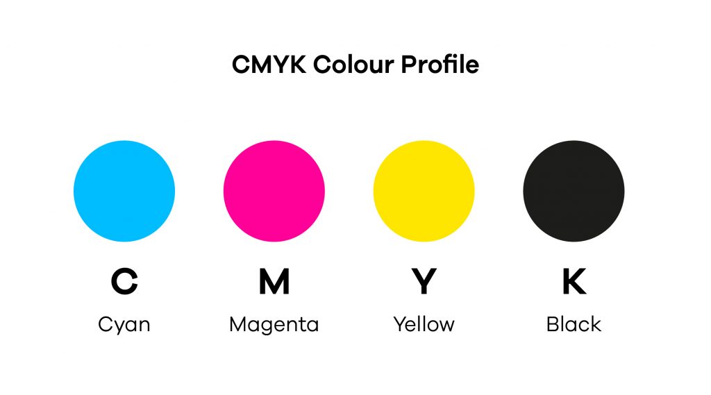
CMYK color model
CMYK (Cyan, Magenta, Yellow, Black) is the color model used for printing, where colors are created by mixing varying percentages of these four inks. However, CMYK can lead to inconsistencies because different printers and printing processes might use slightly different formulations of these inks, resulting in variations of the same color.

https://think3.co.uk/blog/guide-to-cmyk-and-rgb-for-print-and-digital-design/
Pantone
Pantone, on the other hand, is more precise. It standardizes color across the globe, meaning that a Pantone color you see in the guide is exactly the same color that will be printed, whether in a factory in China or on your local printer. Pantone eliminates the risk of color shifts and ensures consistent color reproduction no matter the medium or printing method.
How to Start Using Pantone in Your Design Workflow
If you're just starting with Pantone, here’s a simple step-by-step guide to help you get started:
Download the Pantone App
Pantone has a digital app available on both iOS and Android. With this app, you can access Pantone color guides and even use its color matching tool to find the closest Pantone match for any color in your designs.Choose the Right Pantone Guide
Depending on your needs, select the correct Pantone guide for your medium. For fashion, Pantone TCX and Pantone Polyester are your go-tos. If you’re working with packaging or print media, Pantone Solid Coated or Pantone Solid Uncoated may be more appropriate.Use Pantone’s Color Matching System
If you have a reference image of a color, the Pantone app allows you to analyze the RGB value and suggest the closest matching Pantone code from its guides. You can also manually browse the guide to find the perfect match.Purchase a Pantone Color Guide
While the digital app is useful, many designers still prefer to have a physical Pantone guide. These books contain actual swatches of Pantone colors, allowing you to see exactly how a color will appear on your material.Test and Adjust
Once you have your Pantone code, always test how the color looks on your chosen material before going into production. Remember, fabric and printing methods can affect how colors appear, so it’s always a good idea to see it in person.
Conclusion
Pantone is a game-changer for designers who want to maintain color consistency across their work, whether in fashion, graphics, packaging, or any other industry. By standardizing colors and offering specialized guides for different materials, Pantone ensures that your digital designs are faithfully represented in the physical world, no matter where or how they’re produced.
So, whether you're creating a new line of sportswear or designing a branding kit, Pantone should be your go-to tool for ensuring that your colors are spot-on every time.
Resources:
Pantone’s Official Website: Pantone
Pantone Color Matching System: Pantone Color Guides
About FittDesign
FittDesign is a full-service design and production company specializing in the sportswear and activewear industry. We provide comprehensive solutions, including innovative design, detailed technical packs, and high-quality manufacturing. Our expertise supports brands in creating functional and durable sportswear that meets the demands of a competitive market.
Ready to Bring Your Activewear Vision to Life?
Contact Us today and let’s get started on your project!
